Let me picture your blog. You’ve started using an email service provider (ESP) to collect emails so that you could build an email list for your blog. You tried to add email sign up forms on your blog but are tired of getting email subscribers.
And, you also created a freebie or maybe, a content upgrade to offer as an incentive to your readers. Maybe, you also have a sales funnel ready…
But, people are still not subscribing to your email list?
Is that so?

There could be two reasons for this;
1- Your freebie sucks! Don’t get me wrong, but trust me I had created some terrible content upgrades and it was a complete fail. If that’s your case then you need to create a new killer freebie that leaves no reason for your readers to leave your site without subscribing.
2- The second reason could be the incorrect placement of your email forms. Does it really matters? Definitely! I’ve had outstanding results just by changing the places of my email forms.
Don’t worry.
I’m going to share with you 7 highly-converting places to add your email sign up forms. I suggest you to experiment with few areas in 15 days, and then, try something else.
If you don’t have an email list, here is my easy 2-step tutorial to help you start an email list for free. Yes, you can easily build an email list from scratch.
Trust me, you’ll find out which form is bringing you the maximum subscribers or which one is converting well on your blog. And, you can also A/B test! How good is that?
Do I have to remind you to re-check your freebie and consider working on it again? If you’re comfortable then join my Facebook group and ask for a feedback from other bloggers. Or, just take feedback from your blogging friends or other bloggers in different communities. This will give you an idea of how your freebie is being percieved by an audience.
Let’s find out some best areas to place email sign up forms and grow your email list!
Some links in this post are affiliate links which means if you buy through such link, I will make a small commission. Know that I only promote and recommend products I use or have great experience with.
Quick navigation
7 HIGH CONVERTING PLACES TO ADD YOUR EMAIL FORMS (WITH EXAMPLES)
Before we just dive into areas to place email sign up forms, I’d also like to draw your attention toward Mouseflow. Basically, mouseflow is a website tracking tool that tracks your user’s performance on the site. It uses to analyze where your readers are clicking, or staying on the site.
Are your readers using the sidebar sign up form often? Do they click the ads placed on your site? How long do they stay on your page, and area of your site attracts them the most? How do they navigate?
This tool is a great help if you’re a person like me who wants people to take action on their sites. Their weekly report is also helpful in so many ways. You can start for free, and if you like, upgrade. But, if you aren’t more into collecting reports and actually digging more into users interaction then you can skip using it.
Now, let’s uncover highly-converting website areas for generating leads which results into more subscribers, and customers.
Before I skip to share examples of sign up forms, here is a quick tutorial to start an email list for beginners. I followed the exact steps to start my own email list, and it’s skyrocketing!
1 – Full Screen Form
A welcome mat is a form that displays a fullscreen call-to-action to visitors when they land on a website. Some business owners and marketers use this type of form to give their readers a welcome, quote or maybe, a free offer in exchange for an email address.
Many marketers use this form to get attention from visitors as soon as possible. This also ensures that their main focus is to just grow their email list and invite as many people as possible.
MariaCoz uses a full-screen form on her website with one button. She uses ‘get started’ button to send visitors to her course.

Some email services don’t allow to create this type of forms. However, you can either use Sumo for creating a welcome Matt or use OptinMonster for full-screen form. I use optinMonster for a number of forms so definitely suggest that.
OptinMonster customers use this form to;
- Offer a deal or coupon.
- Showcase new products and services
- Let new visitors understand what to expect from the site
- Win new subscribers by highlighting results, insights etc
- Point visitors to their social media profiles
- Collect email subscribers as part of a prelaunch phase
Isn’t this a great way to collect subscribers?
Related: How To Get Your First 500 Email Subscribers Quickly [5-step plan]
2- As a Feature Box
If you read terms like header, above the fold or feature box then it’s all kind of similar to each other. We have so many examples where people use header to collect emails. I regret not utilizing this space for so long but I had recently rebranded my whole site and a feature box was on my priority list.
I use Genesis Framework so I use a customized feature box and you can see this box at the top of the page where I have displayed my 13-tips blogging course.
If your theme allows a header then you can simply use it and design it according to your brand colours. Bluchic themes have header options, and they just make a perfect website for business owners and bloggers.
If you don’t have a header form yet then consider having one. If your theme doesn’t allow it, then move to other email forms or find something similar that attracts visitors as soon as they land on your site.
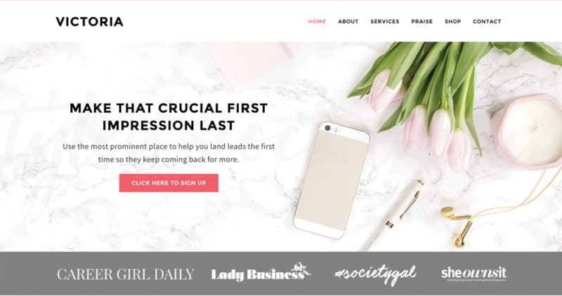
Take a look at this feature box on Victoria theme by bluchic
3- Slide-in Scroll Box
I did not realize the potential of slide-in scroll boxes until I started using it recently and it surprised me.
But, I’ve seen it appear on many websites and I’ve used it to download any free ebook or sign up to their email list. I had no idea whether it converts well, or gives just average conversions.
So, I tried to test out OptinMonster and I’m obsessed with it.
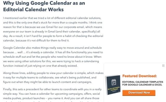
A slide-in scroll box appears at the bottom of the page when the visitors scrolls down. We can also specify how far down the visitors get before they slider-in appears. The best thing is that you can even set different rules to make it only appear wherever you want it to.
If you’re still reading it then I assume you see a slide-in scroll box at the right corner of this page.
Or, take a look at this example from Hubspot’s blog below where you see a small box at the corner of the page.
4- Floating Bar
This one is my favourite! A floating bar is a kind of notification bar that either display on the top of the website or at the bottom.
It ensures a solid call to action and draws attention from the visitors. Simply set it up with OptinMonster and set rulesets to make it visible how you want to. If you’re looking for a free option then use hellobar but the only reason I don’t use it that it’s too limited and only allows up to 5000 pageviews per month.
Jeff Bullas uses this notification bar to share details if someone wants him to speak at any event.

I use a floating bar for;
- Making an announcement
- Offering a discount coupon
- Promote a free challenge or freebie
- Drive visitors to another page / business
Having an email list also means sales funnel. That means, your subscribers will become buyers and hence, you will start making money from your email list. When you are paying for your email marketing softwares, it’s important to determine how to make money from email list.
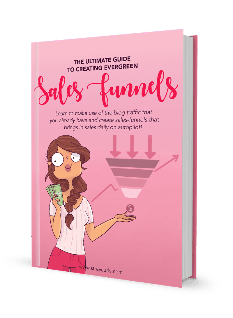
That’s where you dig into sales funnels. This ebook ‘Evergreen Sales Funnels’ is super easy to read and digest. The author has explained concepts of salesfunnel and other strategies very easily. She shows you how to create sales funnels and make money with your email list. I highly recommend getting this ebook.
5- In between the post
I assume many of you already use email forms in between the post. It also converts well but I think you should keep changing the areas to see if it makes any difference.
If you usually display it after 200+ words then try to add it after 400+ words. You should always try and test these forms.
These forms can be simply integrated by using a shortcode. Just copy the code and display it where ever you want it to appear. If you use an email autoresponder tool like Mailerlite, you get a short code via the plugin and use it to display the form anywhere in the post.
Helpful post –> How I Increased my blog traffic to 23,000 pageviews every month! [Tips Revealed]
6- At the end of your blog post
I don’t know whether you’re using the end of your blog post area for conversions or not but I definitely suggest using it.
Many marketers place their forms at the end of the blog posts and it converts really well. This is the area where your visitor is ready to become a subscriber because they have read the whole post, and they can quickly make a decision because if you’re providing excellent value then your readers won’t miss a chance to become your subscriber.
Many bloggers use this area to place their freebie or a paid offer like course, an ebook.
For example, Scroll this page till the end and there, you see an email form. Yeep! I just enabled the settings and now it appears on every page.
Or, visit this post and scroll to the bottom to find an embedded form.
Remember to PIN THE IMAGE below!
7- Lightbox popup (Only when it is well-timed)
Popups can be really annoying but if you’re using them strategically then they give the best conversion rate.
Do not keep your popups less than 45 seconds.
You want your visitors to read your content first, find the core value and then see any offer. If you’ve an irresistible offer or a lead magnet then definitely use popups but make it well-timed and of course, pretty.
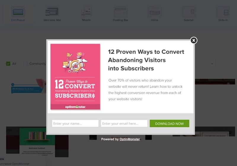
OptinMonster allows you to create lightbox popups that looks fabulous and also can be displayed as you want. Apply the rule and make it appear only after 60 seconds. Or, use the rule to display it to a selected blog post.
Below are some of the best-performing forms that get you high conversions which means more subscribers to your website.
OptinMonster allows you to create different campaigns with different content and offers. You can set any condition you want. For example, you can set visitors device either mobile or desktop. You can also set visitors location, or time spent on your website. All these settings are so helpful in only collecting subscribers that are ready to convert and buy from you. It only costs $9 per month.
I have started experimenting with different forms on my website and the results are outstanding. If you already have a sales funnel or a product, or you’re just trying to build an email list then definitely try it out.
Click here to use OptinMonster for high conversions!
WRAP UP
Have you found new places to display your email sign up form? Do you use optinMonster or any other tool for lead generation? I would definitely like to know what works best for you so I can learn new placement ideas too.
Let me know where you add email sign up forms usually.
Leave your comments below.

Hi Arfa,
This is a helpful post as we all know the corner stone roll played by email list in online business. I have tried these different positions and trust me, the best option that doesn’t obfuscate and distort user experience is your option #5. It helps build a very targeted list segment if you do it as a content upgrade.
Oh sorry I didn’t with you a happy and prosperous new year 2019 😉 and thanks for posting a pinnable article
Hey Enstine,
It’s so good to see your valuable comment. As you said, email list plays a significant role in online business and we should definitely use it as a tool to connect and market. Without any doubt, in-line forms definitely helps in building a targeted list segment and I’m going to use it more.
That’s alright, thanks Han 😉
Thanks for pinning! Always appreciate it.
Hey Arfa,
I second Enstine that this is a great post. There are just many places where you can put email sing up forms.
However, I have another opinion about email sing up forms. I don’t really think it’s necessary to have more than 2 places on a page that ask for an email option. If you have more than 2, I think your lead can be scared and annoyed by the forms.
This blog post from Ahrefs https://ahrefs.com/blog/how-to-promote-your-blog/ has done some A/B testing and they proved that even only 1 signup form is enough. If your content quality is top-notch, leads will look for the place to signup to your emails instead of you popping-up with different lead magnets.
Have you done some testing with your lead magnets (signup forms) if you remove one and see if the numbers increase or decrease? Of course, I know that Ahrefs story doesn’t go along with every blog and niche out there.
Thanks again for the post and real-life examples that you gave.
Cheers,
Melos
Hello Arfa
Good to see these statistics.There are excellent details you posted here and valuable tips for email sign up forms.
Thanks for sharing.
Stay Blessed!
This is great insight arfa. I’ve learnt a lot. But it’s also essential to avoid putting too many forms to avoid annoying readers.
Yep, exactly! One should keep on experimenting to figure out which forms work best for conversions.
Hey Melos,
You’ve made a great insight here. I absolutely agree with adding less forms on a page for better conversions. At times, it can be annoying to have too many forms on a single page. I’m going to read this post and definitely consider A/B testing and I’m sure I may have different results.
Thanks so much for adding your valuable comment here.
Hi Arfa,
Glad that you made the change. It looks much better now and let me know how it goes.
Cheers,
Melos
Great post Arfa!
Scheduled it on Pinterest. I don’t use a sidebar on my sight so my favorite spots for content upgrades are close to the top and right at the bottom. Then I have a top bar with a related freebie and my resource library in my footer.
Given that my posts are long form like yours, I still maintain the neat look and convert at least 10% of new users.
I love teachable’s approach too. They use several related freebies in post, up to 5 sometimes but they never ever use a form.
These are some amazing places to be putting your opt-ins. I never thought to add it to the header as well. I will start implementing these asap. Thank you! 🙂
Hey Rebecca,
Yes, there are! We just have to keep testing all these different areas to determine what works best for our audience while keeping all the other best user experience factors. Yeah, definitely, try these out! Let me know 🙂
Looks Informative Arfa,
Future Box seems to be interesting and I hope this works better compared to others. I am yet to start my Email Marketing campaign, but as a beginner not sure what to offer people when collecting emails. And, you are Master at Pinterest Marketing. I am looking forward to learn more Pinterest tips from you (SheMeansBlogging)!!!